
If you are a web developer or designer, you’re probably familiar with media queries. These snippets of CSS code allow you to create responsive websites that adapt to different screen sizes and devices. However, there can be instances where your media queries might not work as expected, causing frustration and hindering the desired outcome of your design. This article aims to provide you with a troubleshooting guide to help you identify and resolve issues with media queries.
Understanding Media Queries
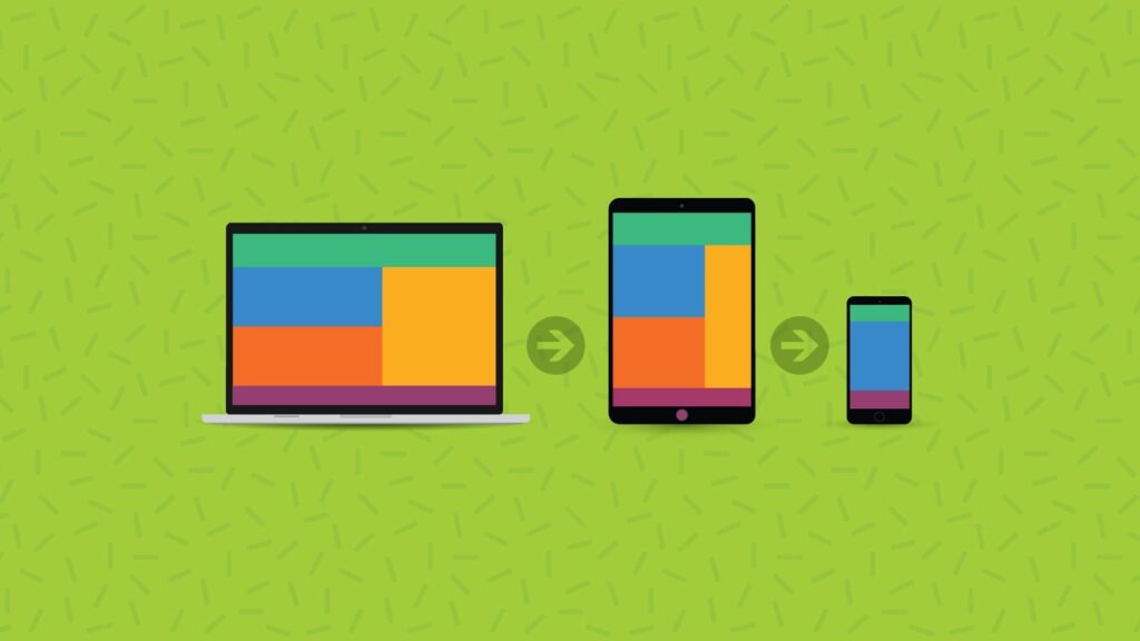
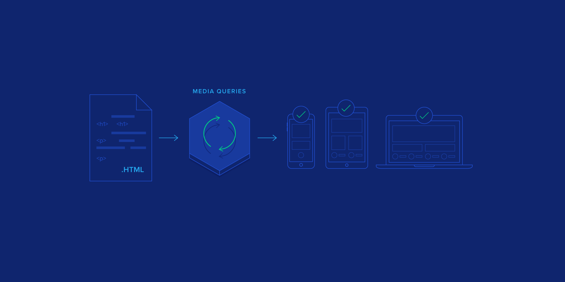
Before we dive into the troubleshooting steps, let’s briefly recap what media queries are and how they work. Media queries are CSS rules that target specific devices based on their screen size, resolution, and other properties. By using media queries, you can create a responsive web design that adjusts to different devices, such as desktop computers, tablets, or smartphones.
Troubleshooting Steps
1. Check syntax and placement: Review your media query syntax to ensure there are no typos or missing parentheses. It’s essential to place media queries within the CSS file or in the section properly.
2. Confirm the compatibility: Verify if the browser you are using supports media queries. Most modern browsers support media queries, but it’s always a good idea to check for compatibility, especially if you are experiencing issues in older versions.
3. Inspect responsive breakpoints: Examine the breakpoints you’ve defined in your media queries. Make sure the values for width, height, or any other properties are accurate and match the intended device’s screen dimensions.
4. Review CSS specificity: Check if there are conflicting CSS rules that may be overriding your media queries. Inspect the CSS specificity to ensure that your media queries are not being overridden by less specific CSS declarations.
5. Clear browser cache: Sometimes, cached CSS files are responsible for media query issues. Clear your browser cache and refresh the page to ensure that you are loading the most recent version of your CSS file.
6. Test on multiple devices: Test your website on different devices with varying screen sizes and resolutions. By doing so, you can identify if the media queries are not working universally or only on specific devices.
Credit: www.toptal.com
Common Mistakes to Avoid
1. Typos and errors: Ensure that there are no typographical errors in your media queries. Every character, including parentheses and curly brackets, should be correct.
2. Using wrong units: Make sure you are using the correct units, such as pixels (px) or percentages (%), when defining the breakpoints within your media queries.
3. Forgetting the viewport meta tag: The viewport meta tag is essential for responsive web design. Check if you have included the tag in your HTML document’s head section.
4. Incorrect order of CSS rules: The order of your CSS rules matters. Make sure that your media queries are declared after the general styles, as media query rules should override the default styles.
5. Overcomplicated media queries: Avoid complex media queries that are difficult to maintain and understand. Keep them clear, concise, and targeted to specific devices or screen resolutions if possible.

Credit: developer.mozilla.org
Frequently Asked Questions On Media Query Not Working : Troubleshooting Tips
What Are Media Queries In Css?
Media queries are CSS rules that apply styles based on device characteristics such as screen size or orientation.
Why Is My Media Query Not Working?
Check for syntax errors, proper use of units, and specificity in the code, ensuring that the media query matches the device.
How To Debug Media Query Issues?
Use browser developer tools to simulate different devices, review CSS specificity, and check media query syntax for any errors.
What Are The Common Media Query Mistakes?
Common mistakes include incorrect syntax, using the wrong units, and not matching the device’s characteristics accurately.
Conclusion
Media queries are powerful tools for creating responsive web design, but sometimes they may not work as intended. By following the troubleshooting guide provided in this article, you can identify and resolve common issues with media queries, ensuring that your website displays correctly on various devices. Remember to double-check your syntax, inspect breakpoints, and test on multiple devices to achieve the desired responsive design.